
Building Shivorix Real Estate - A Premium Dubai Property Brand Designed for Global Investors
Client Overview
ClientShivorix Real Estate
IndustryReal Estate - Property Sales, Investment Advisory and Management
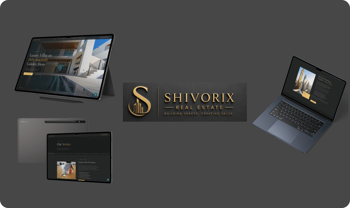
PlatformWebsite (Desktop and Mobile)
ServicesBrand Identity, UI/UX Design, Website Design, Content Strategy, Copywriting, Legal Documentation
About Description
Dubai's real estate market does not lack brokerages. It lacks brokerages worth trusting. Shivorix Real Estate was founded to close that gap. A Dubai-based premium property advisory firm built specifically for international investors, Shivorix operates across residential and commercial transactions, off-plan investments, property management, luxury acquisitions, international property services, and Golden Visa consultation. The founding brief was direct. Build a brand and digital presence that competes at the level of Dubai's most established real estate firms while maintaining the personal, accountable tone that large corporate agencies abandoned years ago. No inflated promises. No recycled broker language. A company that speaks to serious investors the way a trusted advisor would. Our engagement covered every layer of that ambition. Brand identity rooted in a luxury design system. A full two-page website across homepage and services. Nine complete service descriptions built for a global investor audience. A full content suite across every homepage section. Privacy Policy and Terms and Conditions documentation formatted to brand standard. Favicon and digital brand assets ready for deployment. The goal was not to make Shivorix look established. The goal was to make Shivorix be established from the first day anyone encountered the brand.Challenges
- Entering a Market Built on Reputation Dubai real estate runs on trust built over years of transactions. Shivorix was a new company entering a space where credibility is assumed rather than given. Every design decision, every word of content, and every brand touchpoint had to do the work that years of trading history would normally do.
- Designing for Investors Across Four Continents The target audience spans India, the United Kingdom, Canada, Australia, the United States, and the Gulf. Each geography carries different expectations around professionalism, communication style, and what a trustworthy property firm looks like. The brand needed to feel equally credible to a London-based investor and a family in Punjab considering their first overseas asset.
- Making a Premium Brand Functionally Clear Luxury real estate branding frequently prioritises visual drama over usability. For a firm handling transactions worth millions of dirhams, the website needed to be genuinely beautiful and genuinely useful at the same time. Investors making large financial decisions do not have patience for style over substance.
- Writing Content That Converts Without Selling The most financially sophisticated investors are the most resistant to sales language. The content needed to inform, build confidence, and create a sense of accountability without ever sounding like a pitch. That balance is significantly harder to achieve than conventional real estate copywriting.
- Maintaining Consistency Across Nine Distinct Services Nine services covering property sales, rentals, investment consulting, property management, luxury real estate, international markets, corporate advisory, legal assistance, and premium add-ons. Each service required its own voice and focus while remaining unmistakably part of the same brand.
- Legal Documentation That Reflects Brand Values A Privacy Policy that reads like it was copied from a template undermines the trust a brand spends thousands building. The legal documents needed to be genuinely compliant with UAE regulatory requirements and written with the same clarity and intention as every other piece of content in the project.
Our Approach and Solutions
- Establishing the Design System Before Any Design The work began not with pages but with principles. A complete design system was built and documented before a single section was designed. The colour palette of deep charcoal and warm gold was chosen deliberately. Charcoal communicates stability and seriousness. Gold communicates aspiration and precision. Together they produce the visual language of Dubai's architectural luxury without referencing any specific competitor.
- Every spacing value, typography rule, border weight, animation timing, and interactive state was specified and locked before design began. This discipline meant that every deliverable from the homepage hero to the legal document footer maintained a single coherent visual standard.
- Typography Selected as a Brand Decision Font selection was treated as a strategic choice rather than an aesthetic preference. Cormorant Garamond was selected for all display and heading content. It carries the weight of editorial publishing and financial communications. It reads like a brand that has been around long enough to have earned its tone.
- Jost was selected for all body and interface content. Clean, geometric, and internationally legible across every device and every language background. The pairing communicates refinement and accessibility simultaneously, which is precisely the register Shivorix needed to occupy.
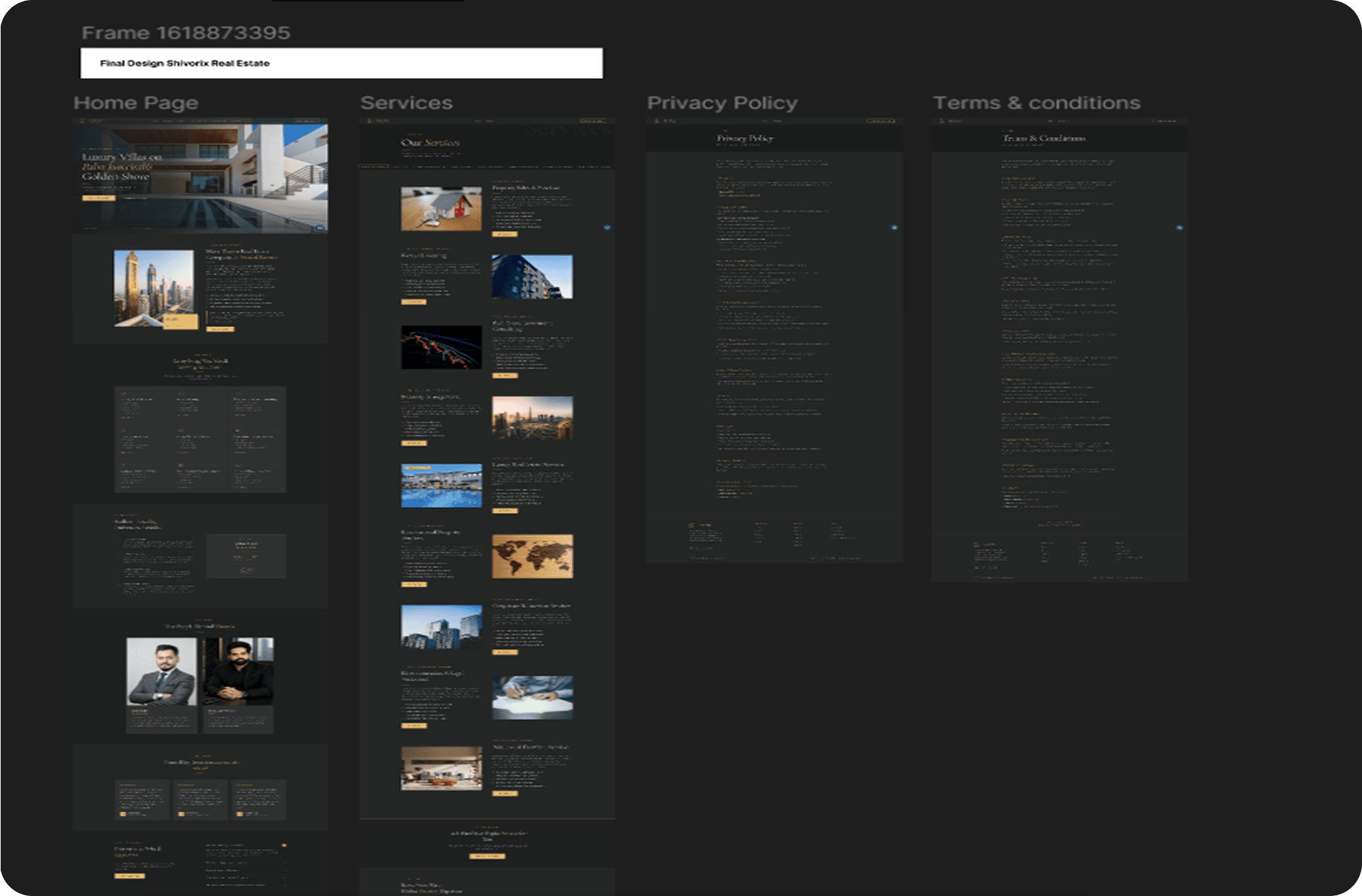
- Homepage Architecture Built Around the Investor Journey The homepage was structured across eight sections with a clear purpose assigned to each. The hero communicates the core proposition within three seconds of arrival. The about section establishes the human story behind the business. The services section demonstrates depth and range. The why choose us section converts interest into genuine confidence. Testimonials provide social proof at the moment of maximum consideration. The FAQ section removes the barriers that prevent serious investors from making contact. The contact form closes the page with a clear and low-friction next step.
- Every section was designed with full interaction specifications including scroll animation behaviour, hover states, button transitions, and mobile adaptation. Nothing was left to developer interpretation.
- Services Page Designed as a Decision Tool The services page was not designed as a catalogue. It was designed as a tool that helps an investor identify the service most relevant to their situation and understand exactly what engaging that service involves. A sticky navigation bar allows immediate access to any of the seven core services. Each service section uses an alternating visual layout with supporting metric badges, detailed feature lists, and a four-step process timeline that makes the client experience concrete and legible.
- A service comparison table and a full-width CTA banner close the page with a structured next step that does not feel forced.
- Content Written From First Principles Every word across the entire project was written from scratch. No templates were used. No existing real estate copy was adapted. The content strategy was built on a single governing principle: speak to a financially serious international investor the way a trusted advisor would, not the way a broker trying to close a deal would.
- The about section opens with a market observation rather than a company description because serious investors respond to perspective before they respond to credentials. The service descriptions open with a client situation before they describe what Shivorix does, because relevance precedes interest. The FAQ answers are complete enough to genuinely inform but short enough to create a reason to call.
- Nine Services Written to a Locked Structure Each service description follows a precise and consistent architecture. A category sub-tag establishes the service context immediately. The headline names the service with clarity. The body paragraph opens with a direct client situation, builds the service's value, and closes with a confidence statement. Five focused pointers cover the key inclusions in language that is scannable without being superficial. A call to action closes each service with a consistent forward step.
- The structure was maintained identically across all nine services. Consistency at this level communicates operational discipline, which is exactly the signal a property management or investment firm needs to send.
- Legal Documents Built as Brand Assets The Privacy Policy and Terms and Conditions were written as complete, UAE-compliant legal documents and formatted as branded deliverables. Gold section headings, company headers and footers on every page, clean paragraph spacing, and a closing brand statement made the documents feel like a deliberate part of the Shivorix brand rather than a compliance obligation handled as an afterthought.
Results and Impact
- Shivorix launched with a complete, professional, and fully specified digital presence across every client touchpoint.
- The brand identity is built to operate at the level of Dubai's most recognised real estate names from the first day of trading. The design system is fully documented and transferable to any future design or development team without loss of standard.
- The website content positions Shivorix as a globally relevant firm from the outset, removing the geographic limitations that typically constrain newly established brokerages to a single investor community.
- The nine service descriptions give Shivorix a content foundation that supports the full sales cycle from first discovery through to active instruction, across every service category the business operates in.
- The legal documentation is compliant, readable, and on-brand, removing a friction point that many early-stage businesses leave unresolved until it becomes a problem.
- The favicon, brand assets, and design tokens are ready for immediate deployment across the website, social channels, and any future marketing collateral.